Build a Marketing Dashboard in Two Hours: 9 Role Based Examples

Copy a role-specific dashboard rather than building one from scratch, and start with a single programme-level “always-on” view limited to five to nine metrics. That structure, before any tool choice, is what separates a dashboard people actually open from one that dies after week two. This guide walks through role- and channel-specific examples, ready-to-copy templates, and a two-hour build plan, drawing on adoption patterns Tech Business Development sees across small business analytics engagements.
TL;DR:
- Keep dashboards focused on five to nine essential metrics tailored to the audience and decision they support, avoiding metric overload.
- Prioritize lead indicators at the top of the dashboard and outcome measures below to provide early warnings before results are confirmed.
- Use native connectors like GA4, ad platforms, and CRM integrations to ensure data freshness, and automate updates to prevent stale information.
- Build dashboards around specific roles and decisions, and involve stakeholders beforehand to ensure relevance and ongoing adoption.
- Limit dashboard access based on roles, anonymize personal data when possible, and regularly review permissions to protect data privacy.
Table of Contents
- Marketing dashboard examples by role and channel
- What every marketing dashboard needs: leading vs lagging KPIs
- Choosing a platform: Looker Studio, Power BI, Tableau, or a spreadsheet
- Why most marketing dashboards fail (and how to fix it)
- Three marketing dashboard templates you can build today
- Turning dashboard numbers into decisions
- Keeping dashboard data secure and private
- What actually makes a dashboard stick
- Get a working dashboard without the trial and error
- Sources
- FAQ
Marketing dashboard examples by role and channel
A dashboard built for a CMO fails when it lands in front of a paid media specialist, and vice versa. The fix is matching the audience, the metric set, and the refresh rate to the decision someone actually needs to make. Below are nine working examples, each annotated with who reads it, what it tracks, and how often it should update.
- CMO / executive overview. Audience: leadership and department heads. KPIs: revenue influenced by marketing, customer acquisition cost (CAC), marketing-sourced pipeline, return on marketing investment (ROMI), brand search volume, and customer lifetime value (LTV). Cadence: monthly, with a quarterly deep review. Layout: one scorecard row of big numbers with sparklines, followed by a trend chart underneath.
- Paid media / Google Ads. Audience: paid media managers. KPIs: cost per click, click-through rate, cost per acquisition, return on ad spend (ROAS), impression share, and conversion rate by campaign. Cadence: daily to weekly. Layout: a channel breakdown table with a spend versus conversions chart beside it.
- Web analytics. Audience: growth and content teams. KPIs: sessions, bounce rate, average session duration, goal completions, and top landing pages. Cadence: weekly. Layout: a funnel slice showing traffic to conversion, paired with a device breakdown tile. A website success measurement guide is a useful companion when deciding which of these metrics actually predicts revenue.
- SEO performance. Audience: content and SEO leads. KPIs: organic sessions, keyword ranking distribution, backlinks gained, indexed pages, and organic conversion rate. Cadence: weekly to monthly. Layout: a ranking-movement table beside a big-number tile for organic traffic trend.
- Social media monitoring. Audience: social and community managers. KPIs: engagement rate, follower growth, share of voice, video completion rate, and click-throughs to site. Cadence: weekly. Layout: a channel comparison bar chart with a sentiment or comment-volume tile.
- Email / newsletter. Audience: lifecycle marketers. KPIs: open rate, click rate, unsubscribe rate, list growth, and revenue per email. Cadence: per-send plus a weekly rollup. Layout: a send-by-send table with a trailing 90-day trend line.
- Lead generation. Audience: demand generation and sales-alignment teams. KPIs: marketing qualified leads (MQLs), MQL-to-SQL conversion rate, cost per lead, form completion rate, and lead source breakdown. Cadence: weekly. Layout: a funnel visual stacked above a source-attribution pie or bar chart.
- Campaign performance. Audience: campaign managers running a specific launch. KPIs: reach, spend pacing against budget, conversions, cost per conversion, and creative-level performance. Cadence: daily during active campaigns. Layout: a campaign scoreboard with per-creative tiles, since templates covering these dashboard types consistently show campaign leads need per-asset granularity, not just channel totals.
- Attribution / ROI snapshot. Audience: CMO and finance. KPIs: marketing-sourced revenue, ROMI, multi-touch attribution weighting, and payback period. Cadence: monthly. Layout: a single revenue-impact tile with a channel-contribution waterfall chart.
What every marketing dashboard needs: leading vs lagging KPIs
Every dashboard on that list mixes two kinds of numbers, and confusing them is the most common design mistake. Leading indicators move first and warn you something is changing, things like publishing velocity, ad impressions, or email open rates. Lagging indicators confirm the outcome after the fact, like closed revenue, CAC, or marketing-sourced pipeline. A dashboard built entirely on lagging metrics tells you what already happened; one built entirely on leading metrics never confirms whether any of it mattered.
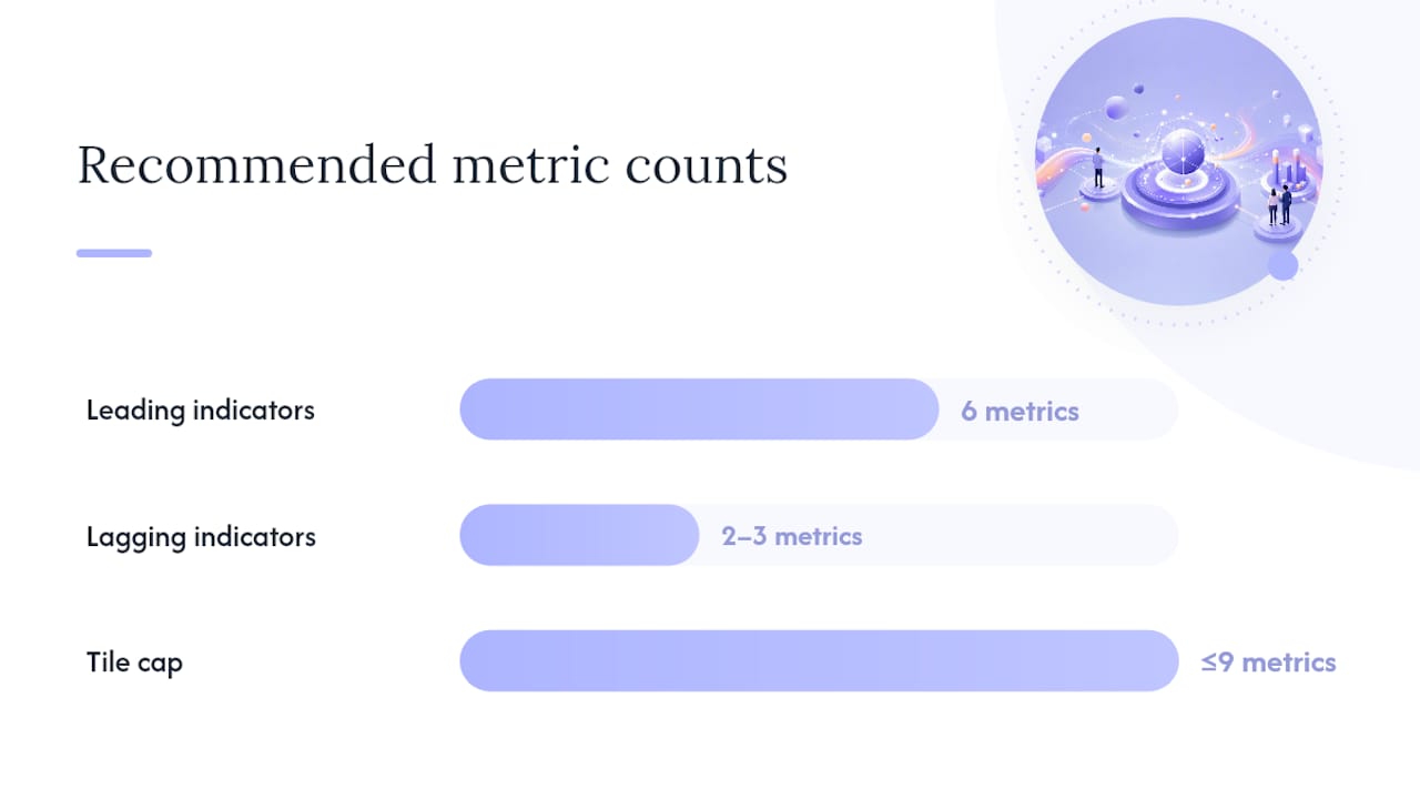
Guidance from the Pedowitz Group on leading versus lagging indicators recommends roughly six leading metrics against two or three lagging ones, which gives early warning without losing sight of the outcome.
Three rules make this workable:
- Cap the tile count. Nine or fewer metrics per view. Beyond that, nobody scans the whole thing, they skim the top row and ignore the rest.
- Stack leading over lagging. Put the fast-moving warning signals at the top of the page, and the outcome metrics below, so a reader gets the “is this working” answer before the “did it pay off” answer.
- Attach formulas, not just labels. CAC is total marketing spend divided by new customers acquired in the period. ROAS is revenue attributed to a channel divided by spend on that channel. Label the attribution window (7-day click, 30-day view) directly on the tile.
Marketing dashboards generally group metrics into acquisition, engagement, conversion, and revenue impact, and Klipfolio’s guidance on marketing KPI monitoring recommends daily-to-weekly checks on campaign metrics but only monthly review of strategic KPIs like ROMI, since those numbers rarely shift meaningfully week to week.
Choosing a platform: Looker Studio, Power BI, Tableau, or a spreadsheet
The tool matters less than most teams assume. A cleanly structured spreadsheet with the right five metrics beats an expensive BI platform stuffed with forty tiles nobody reads, a point Metabase’s analysis of common dashboard failures makes directly: structure and decision context outrank tool sophistication almost every time.
That said, each platform earns its place at a certain scale:
- Spreadsheets work for a single team tracking under ten metrics with manual weekly updates. Zero cost, but no live connectors.
- Google Looker Studio connects natively to Google Analytics 4, Google Ads, and Search Console, and it is free. It’s the fastest path to an interactive, shareable dashboard once you outgrow a spreadsheet, and Looker Studio dashboard tutorials walk through the exact connector setup most small teams need.
- Microsoft Power BI suits teams already inside the Microsoft ecosystem, with strong data modelling and community-built templates, including CMO-focused Power BI dashboards other marketers have already built and shared.
- Tableau handles complex, high-volume datasets and heavy customization best, but it carries the steepest licensing cost and learning curve of the four.
Whichever platform you choose, prioritize filters, drilldowns, and annotation fields, since practitioners consistently flag drilldown interactivity as essential for moving from a summary number to its cause without exporting data elsewhere.
Pro Tip: Build one shared view for leadership before you build anything else. A single, agreed-upon “source of truth” dashboard prevents the five competing spreadsheet versions that show up in every marketing meeting eventually.
Why most marketing dashboards fail (and how to fix it)
Most marketing dashboards fail within 90 days, not because the data is wrong but because stakeholders simply stop opening them. The usual culprits: too many metrics competing for attention, a dashboard built for the wrong audience, data that goes stale between refreshes, and tiles with no context explaining what changed or why.
The fix is to treat the dashboard as a product, not a report:
- Interview the three or four people who’ll actually use it before building a single tile.
- Cut the metric list to what drives a real decision, not everything that’s measurable.
- Schedule a recurring review, even fifteen minutes monthly, so the dashboard stays tied to a real conversation.
- Add a one-line annotation on tiles where a number moved sharply, so viewers don’t have to ask why in the next meeting.
- Automate distribution (email digest, Slack post) so the dashboard reaches people instead of waiting to be visited.
| Problem | Fix | Adoption metric to watch |
|---|---|---|
| Metric overload | Cap at 5–9 tiles | Dashboard opens per week |
| Wrong audience | Interview stakeholders first | Drill-down click count |
| Stale data | Automate refresh schedule | Time since last data pull |
| No context | Add short annotations per tile | Decisions traced back to dashboard |
Three marketing dashboard templates you can build today
Three starters cover most needs without a custom build. Each maps to a specific audience and takes under two hours to assemble in Looker Studio or a well-structured spreadsheet.
- Always-on KPI dashboard. Eight tiles total: six leading indicators (traffic, impressions, engagement rate, MQLs, email open rate, social reach) and two lagging indicators (CAC, marketing-sourced revenue), following the eight-tile always-on framework built specifically to catch problems early.
- Campaign spotlight. Channel-by-channel tiles (spend, conversions, cost per conversion) beside a conversion funnel chart. Built for the length of a single campaign, then archived.
- Executive one-pager. ROMI, pipeline impact, and a three-line trend chart. One page, no scrolling, since a focused single-page executive view reduces the back-and-forth in leadership meetings.
Two-hour build checklist: connect your two or three core data sources (GA4, ad platform, CRM), build one tile per metric rather than combining several into one chart, add a 13-week sparkline to each tile, set colour thresholds for on-track versus at-risk, and write one short annotation per tile explaining what “good” looks like. Tech Business Development’s guide to visualizing marketing data for stakeholders covers the layout choices that make an executive one-pager land well in a boardroom setting.
Turning dashboard numbers into decisions
A dashboard only earns its keep when a number on it changes what someone does next.
A web analytics dashboard showing bounce rate spiking on one landing page while sessions hold steady usually points to a page load or messaging mismatch introduced in a recent change, prompting a direct A/B test rather than a broader traffic push.
On the lead generation side, a dashboard showing MQL volume rising while MQL-to-SQL conversion falls tells you the top of funnel is working but lead quality has slipped, which shifts the fix toward tightening lead scoring or targeting criteria rather than spending more on acquisition.
An attribution snapshot showing one channel driving disproportionate marketing-sourced revenue relative to its share of spend is the signal to shift budget toward that channel, and away from a channel with the inverse pattern. None of these require complex modelling. They require someone actually looking at the dashboard on a fixed cadence and asking what changed since last week, which is exactly the habit most failed dashboards never establish.
Keeping dashboard data secure and private
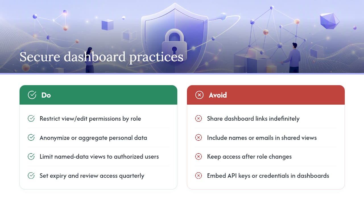
Marketing dashboards routinely pull customer-level data, and that means access controls matter as much as visual design. Restrict view and edit permissions by role, not by convenience, so a channel-level social dashboard doesn’t expose CRM revenue figures to someone who only needs engagement metrics.
Anonymize or aggregate personal data wherever the analysis doesn’t require an individual record. A lead-generation dashboard needs conversion counts and source attribution, not a list of names and email addresses sitting in a shared view. Where personal data does need to appear, for example a sales-alignment dashboard tracking named accounts, limit that view to the people with a legitimate reason to see it.
Set expiry and review dates on shared external links. A dashboard link shared with an agency partner or client should not stay live indefinitely after the engagement ends. Audit who has access on a recurring basis, quarterly at minimum, and remove access the moment someone changes roles or leaves a project.
Finally, treat the underlying data connections (API keys, CRM integrations, ad platform credentials) the same way you’d treat any other credential: rotate them periodically, and never embed them directly in a dashboard that gets shared broadly.
What actually makes a dashboard stick
The dashboards that survive past ninety days share one trait: someone treated the build like a product decision, not a data-visualization exercise. Tech Business Development’s marketing analytics best practices for consultants reflects that same pattern across small business engagements: the failure point is rarely the tool, it’s skipping the stakeholder interview and shipping a dashboard nobody asked for.
Build in-house when your team already has someone comfortable in GA4, a BI tool, and basic SQL or spreadsheet formulas, and when your data sources are already reasonably clean. Bring in outside help when you need connectors wired up fast, ongoing governance so the dashboard doesn’t rot in three months, or automation that frees your team from manual exports every Monday morning. Most small teams underestimate how much time the second category actually costs them.
— Shayan Shirvani
Get a working dashboard without the trial and error
Building the right dashboard structure takes longer than most teams expect, mostly because the hard part is deciding what to leave out, not what tool to use. Tech Business Development handles the full setup, GA4, Google Tag Manager, Looker Studio builds, and CRM connectors, so your team gets a working dashboard in days rather than weeks of trial and error.

Engagements typically start with a quick setup phase covering Google services configuration and dashboard builds, then move into ongoing monthly management so the dashboard stays current as your campaigns change. Plans start at $499 per month with the Startup tier, scaling up to Growth and Scale tiers as your reporting and automation needs grow. If you’re tired of rebuilding the same spreadsheet every quarter, request a quote through the pricing page and get a dashboard structured around decisions your team actually makes.
Sources
Every dashboard example above depends on data flowing in cleanly and on schedule, and that’s where most builds quietly fall apart. Prioritize your core connectors first: GA4 for site behaviour, your CRM for pipeline and revenue, and your primary ad platforms for spend and conversions. Layer in email and social platforms once the core three are stable.
Native connectors (GA4 into Looker Studio, HubSpot’s own reporting connectors) are more reliable than manual CSV exports, since manual exports are the single biggest source of stale data on a dashboard. Where a native connector doesn’t exist, a scheduled automation, even a simple nightly export job, beats a person remembering to update a spreadsheet.
Set a refresh cadence that matches the decision, not the technical maximum. Campaign-level tiles can refresh daily since decisions happen daily during an active launch. Strategic KPIs like ROMI don’t need daily refresh, since monthly review is the recommended cadence for numbers that move slowly and get reviewed slowly.
Document what each metric means and where it comes from directly on the dashboard, or in a linked reference sheet. When a new hire or a different department opens the dashboard six months from now, that documentation is the difference between trust and a skeptical email asking where the number came from.
FAQ
What is a marketing dashboard?
A marketing dashboard is a visual summary of marketing performance data pulled from multiple sources, like ad platforms, GA4, and a CRM, into one view. It’s built around a specific audience and decision, not just a data dump, and it typically mixes leading indicators (early signals) with lagging indicators (confirmed outcomes) like Klipfolio’s monitoring framework recommends.
How do you build a marketing dashboard?
Start by picking one audience and one decision the dashboard needs to support, then limit the metric set to five to nine KPIs tied to that decision. Connect your core data sources (GA4, CRM, ad platform), build one tile per metric with a short trend line, and add brief annotations explaining unusual movement. Tech Business Development can handle this build end to end through its analytics and dashboard services.
Can ChatGPT make dashboards?
ChatGPT and similar AI tools can help draft dashboard structure, suggest KPI formulas, and write query logic for a BI tool, but they don’t connect directly to live marketing data on their own. You still need a platform like Looker Studio, Power BI, or Tableau to pull, refresh, and visualize the actual data.
What are the four types of dashboards?
Dashboards are commonly grouped into strategic (executive, monthly trends), operational (daily or weekly campaign tracking), analytical (deep-dive trend and comparison analysis), and channel-specific (paid media, SEO, social, email) types. Most marketing teams need at least one strategic view and two or three channel-specific views to cover their reporting needs fully.
How often should a marketing dashboard update?
Campaign and channel-level metrics generally need daily-to-weekly updates since decisions happen on that timeline, while strategic KPIs like ROMI only need monthly review because those numbers move slowly, a cadence Klipfolio’s guidance backs directly.
Recommended